
To ensure the features we designed aligned with user motivations, I advocated for a design research budget.
The High Fidelity team knew intuitively from observations that a new creative tool would be valued by the user community. However, before ideating product features, I felt the design process needed more direct input from two groups: High Fidelity’s existing user base, and prospective users High Fidelity hoped to target.
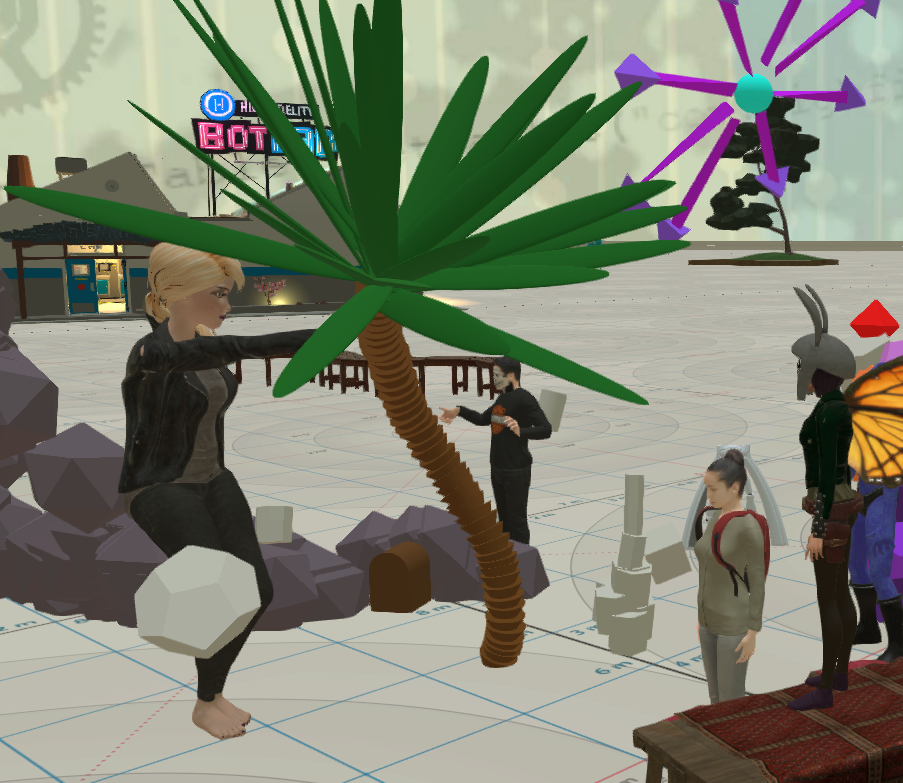
In a two-week research sprint, I donned my virtual clipboard and roamed around several High Fidelity’s domains, starting up conversations with users to learn out about how they were using the High Fidelity product. I also interviewed several users who fit the profile of High Fidelity’s prospective user base to understand their motivations for using VR.
For users, virtual creation was less about making things, and more about making friends.
We build relationships by sharing novel experiences. Whether it’s traveling with family, going to a concert with friends, or building a product with co-workers, our relationships start and are strengthened by encountering new, unique situations with other people. If we foster an environment where it is simple and fun to make the building blocks for novel experiences, and where these novel experiences can arise unexpectedly and spontaneously, then we simultaneously foster an environment that’s natural for starting and strengthening relationships.
In short, our team decided to focus on enabling users to make the ‘about’ things – things to talk about, to laugh about, to remember about.
200+ data points later, it became clear that there were a broad range of users on High Fidelity’s platform. Based on initial research, I recommended that the Shapes project focus on tools for social creators, rather than meticulous artist or designer-types. For these personas, the social and collaborative experience represents a core intrigue and motivation for participation in High Fidelity. For these personas, virtual building served as a ‘means to an end’ for introduction into a new community, a tool for facilitating social connection and conversation.
I led the team through several prototype iterations, and tested the app with users biweekly to identify design flaws.
Constructing information architecture from scratch
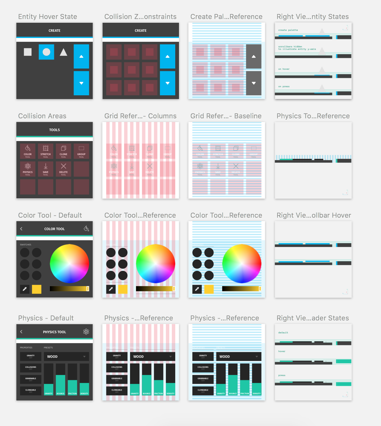
AR/VR products face a unique challenge; in many cases, the existing paradigms the user is familiar with doesn’t align with the capabilities and task flows of a VR app. My earliest ‘wireframe’ prototypes sought to discern how users would most naturally seek to create and interact with objects and apply parameters like size, color, and physics to them. I conducted a close comparative analysis of several existing 3D creation tools, and sketched several ideas to tease out the wide range of how users might conceptualize this tool.
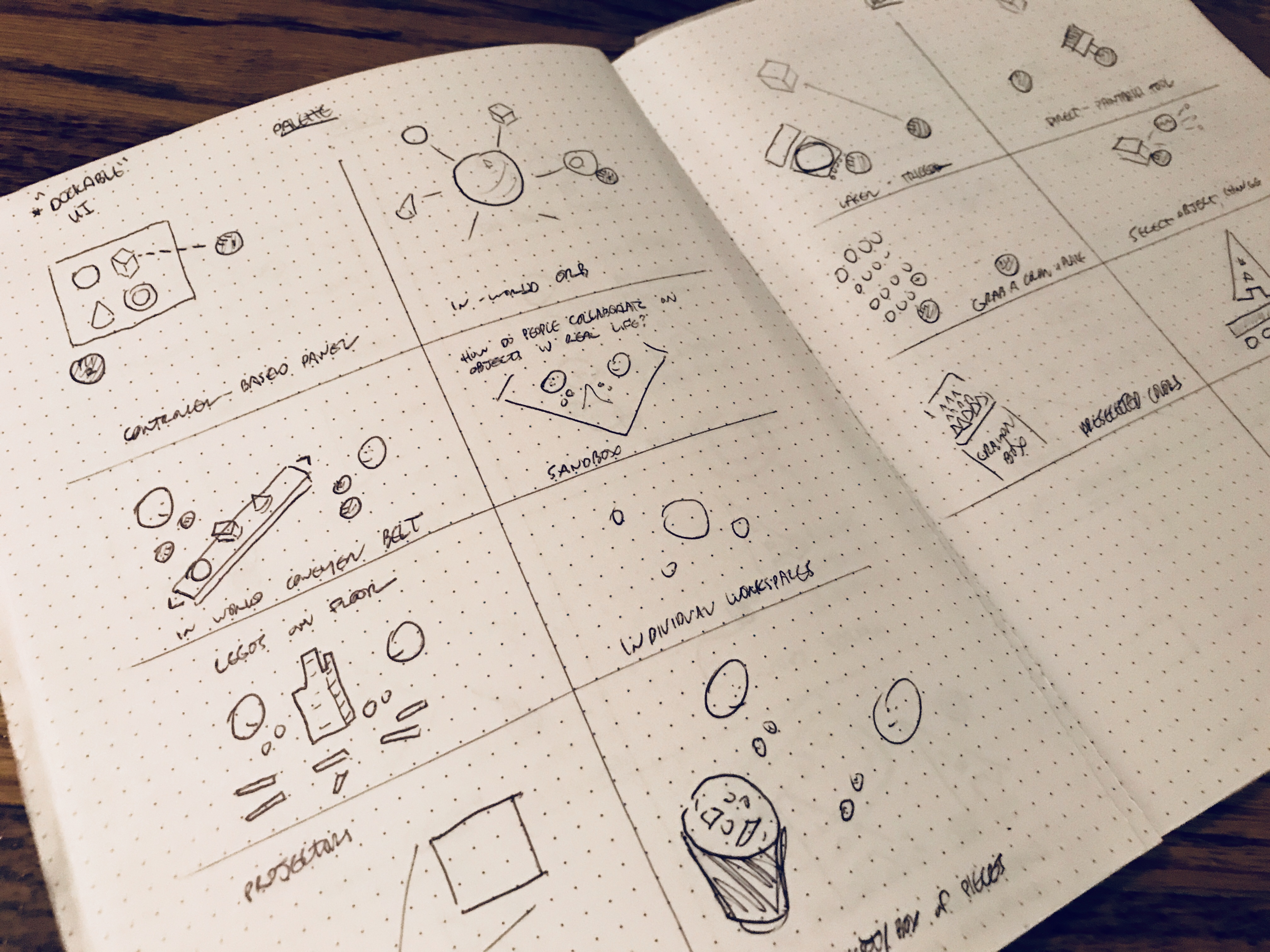
Defining ergonomics.
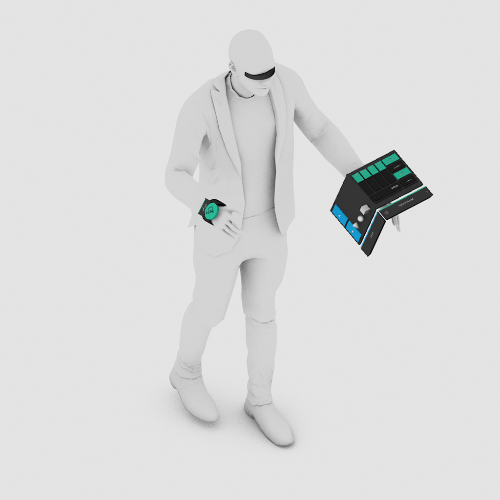
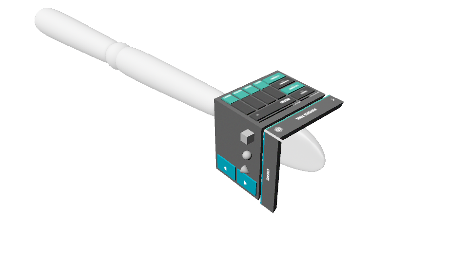
Moreso than I ever would have expected, the question of “where” to place UI components became a consistent design question. We ran extensive A/B testing in the early prototype stages to understand where menus were comfortable, where they weren’t, and how this intersected with visual usability. For example, the decision to mount the UI on the avatar’s hand joint, rather than wrist joint, was in part due to the need for a two-sided menu (so the user could flick their wrist to access a different “side” of the menu), and the need for precise selection of UI elements (for example, color selection) when using the dominant hand as a pointer.
Giving the app a great feel.
It’s hard to give users a lot of features without giving them a lot of menus. We knew from comparative analysis that VR apps that “feel” great don’t rely on the user remembering a lot of controller buttons. Great VR apps tend to use a “grab-first” interaction paradigm so users only have to think about a primary interaction. Many of the UI design decisions ultimately came down a) maintaining a “physical” paradigm in which the UI was navigable with the trigger, rather than distributed across controller buttons, and b) respecting High Fidelity’s platform-wide button mappings for basic navigation.
Building a system for feature growth.
The Shapes beta would not include all features on the roadmap, but the UI paradigm I was creating had to be flexible enough to accommodate new features as they were built. A major change in UI interaction paradigm in future releases would be extremely disruptive to existing users. Ultimately, I decided that a tool-based paradigm would allow new capabilities to be added to the app on High Fidelity’s timeline, without disrupting the user experience.
Reducing cognitive load with gestures.
With Fantastic Contraption as an inspiration, our initial prototypes investigated ways menus and buttons could be reduced and offloaded to hand and arm gestures. One memorable user during testing told a story about how he once visited a friend for dinner, and the friend’s father threw chicken bones behind his shoulder into the alleyway. Rather than rely on a button or tool for deletion, I prototyped a gesture that allows users to toss an object behind their head to delete it. I called it "chickenboning."
Reimagining UI components for VR usability.
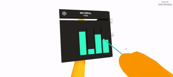
One of the Shapes tools required a continuous slider, but we found that selecting with precision was difficult and uncomfortable when relying on user elbow rotation. I prototyped a microinteraction that would expand the component to allow for a higher level of precision with greater comfort.
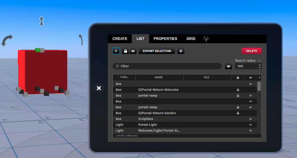
I worked closely with the production engineer to spec and optimize the final design for live deployment.
High Fidelity runs on its own open-source tech stack that allows for performant multi-user collaboration. This tech stack had its own set of capabilities and constraints that differed from the Unity environment I was familiar with.
I worked closely with the engineer to tweak app features to better fit within the performance bounds that High Fidelity required for its deployed apps.
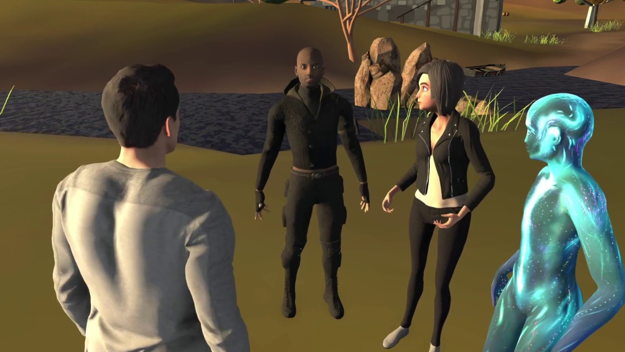
One week after its beta release, Shapes rose to the top of High Fidelity’s Marketplace.
Shapes resonated with the High Fidelity user base, rapidly becoming the third most downloaded app on the High Fidelity Marketplace – putting it in the top 1% of apps on the store. It lowered the barrier to entry for 3D creation, and allowed users to build their domains more naturally with their friends.